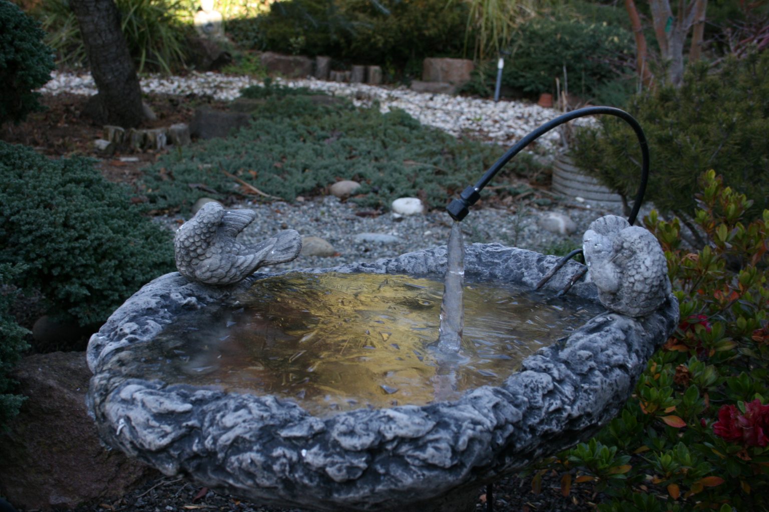
CF and I were just talking (March 2019) about how we haven’t seen any ice in the backyard for a number of years. But it wasn’t always this way — picture taken in January 2007.
The Bug Apocalypse
Originally shared by Allen Knutson
This is the scariest article I’ve read in a really long, scary, time.
“(It’s easy to read that number as 60 percent less, but it’s sixtyfold less: Where once he caught 473 milligrams of bugs, Lister was now catching just eight milligrams.) “It was, you know, devastating,” Lister told me. But even scarier were the ways the losses were already moving through the ecosystem, with serious declines in the numbers of lizards, birds and frogs. The paper reported “a bottom-up trophic cascade and consequent collapse of the forest food web.” Lister’s inbox quickly filled with messages from other scientists, especially people who study soil invertebrates, telling him they were seeing similarly frightening declines. Even after his dire findings, Lister found the losses shocking: “I didn’t even know about the earthworm crisis!”
The sky was a ruddy haze this morning.
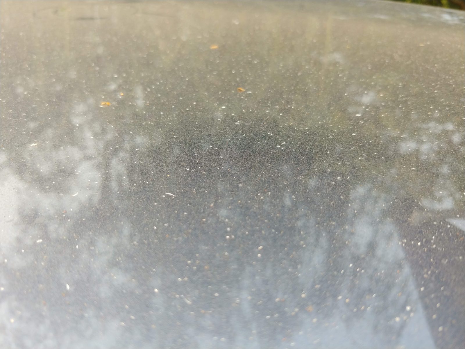
The picture is the hood of my car. The dust and white specks are ash from the fires north of here.
The “Mendocino Complex” fire is “the largest wildfire in California history”, according to a headline.
Meanwhile, the Ferguson fire in Yosemite is still burning. All park entrances except the east side Tioga entrance are closed.
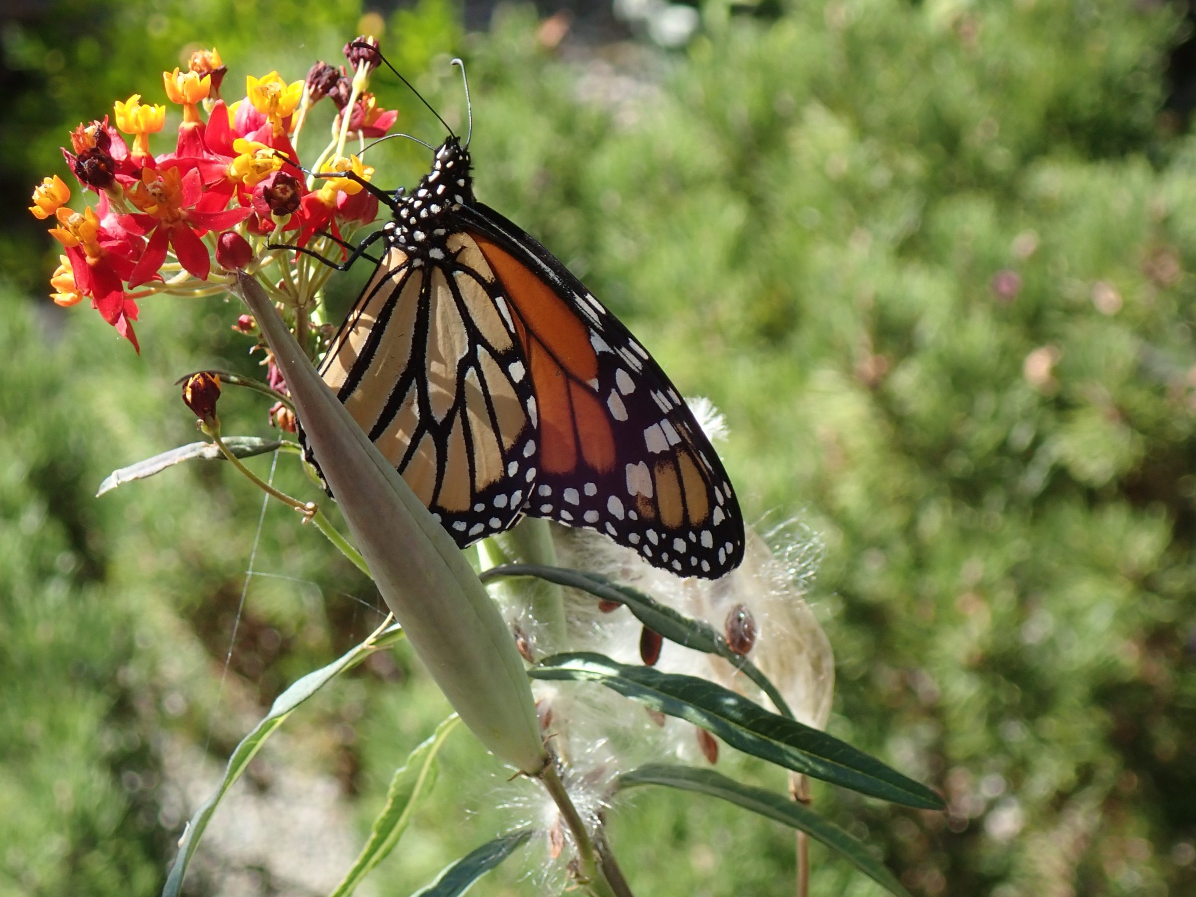
A Monarch visiting our milkweed
Get your solar while you can…
Originally shared by Electric Cars
International Trade Court rules Suniva and US Solar panel industry injured – what does it mean and who will be hurt
https://electrek.co/2017/09/22/international-trade-court-itc-suniva-tariff-solar-panels/
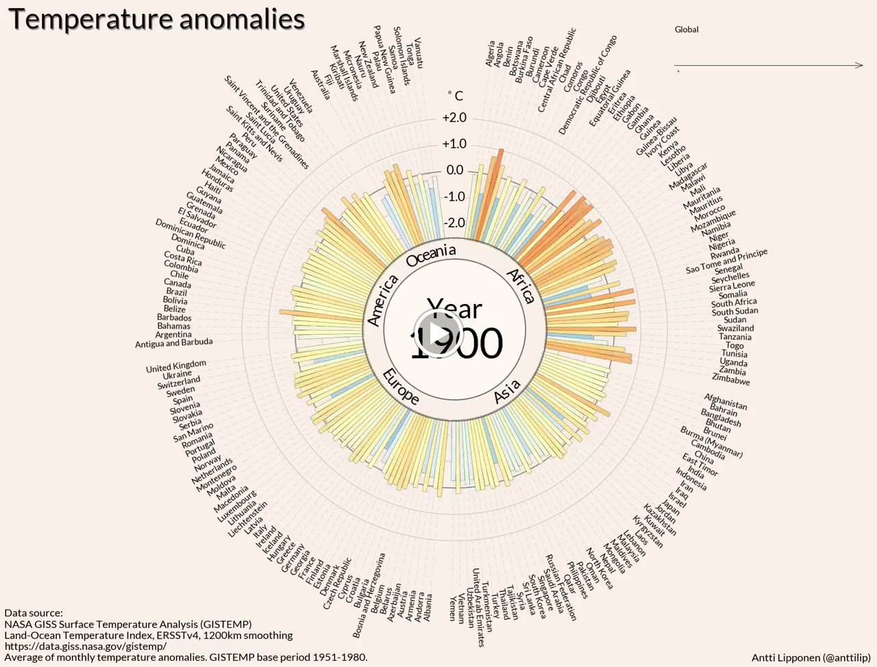
Temperature anomalies arranged by country 1900 – 2016
Originally shared by Pierre Markuse
Temperature anomalies arranged by country 1900 – 2016
Take a look at this beautiful data visualization by Antti Lipponen. It shows the average monthly temperature anomalies arranged by country from 1900 to 2016 with a base period of 1951 to 1980. A quite impressive visualization of climate change.
Download and images here:
https://flic.kr/p/W3wPeE (Video)
https://flic.kr/p/XjiYjX (2016 static image)
https://flic.kr/p/XfEejG (1980 static image)
This NASA Earth Observatory article on global warming is answering some of the most asked questions:
http://earthobservatory.nasa.gov/Features/GlobalWarming/
If you yourself or friends have doubts about climate change, I also recommend to watch this video, addressing some common misconceptions: 13 Misconceptions About Global Warming http://youtu.be/OWXoRSIxyIU
Image credit: Temperature anomalies arranged by country 1900 – 2016 Antti Lipponen (https://twitter.com/anttilip) CC BY 2.0 https://goo.gl/sZ7V7x
See more of Antti’s stuff here on Flickr:
https://www.flickr.com/photos/150411108@N06/
Thank you for your interest in this Climate Change/Earth collection. Maybe add me on Google+ (Pierre Markuse) and Twitter (https://twitter.com/Pierre_Markuse) or have a look at the Astronomy/Astrophysics collection here: https://goo.gl/x0zPAJ or the Space/Space Technology collection here: https://goo.gl/5KP0wx
#science #earth #globalwarming #climatechange #temperature #temperatureanomalies #dataviz #datavisualization
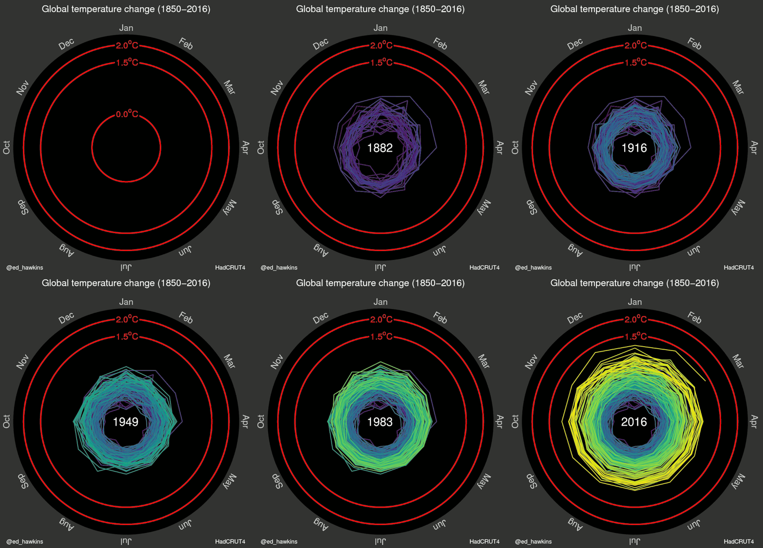
A striking representation…
Originally shared by Joel Carlson
