

Originally shared by Pierre Markuse
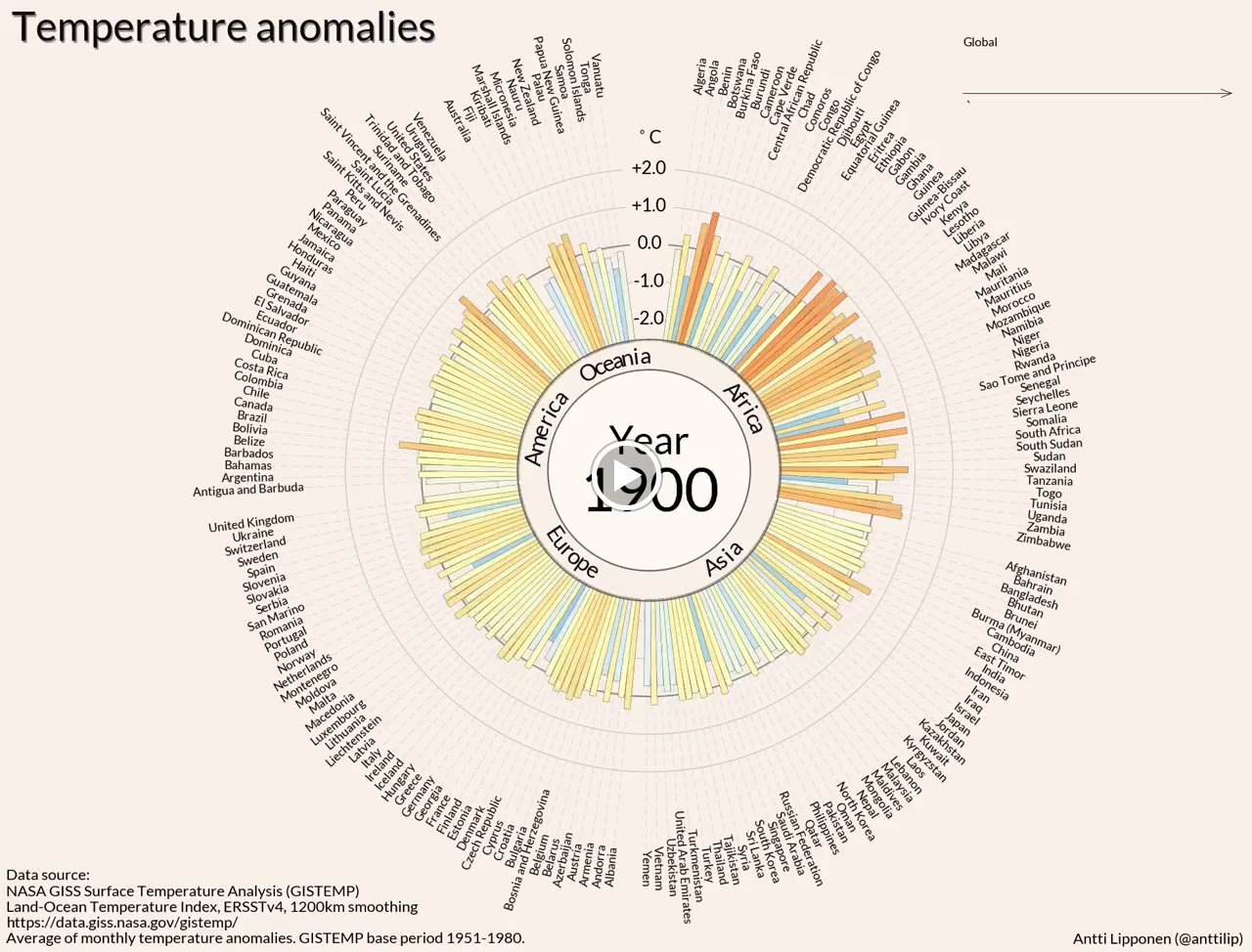
Temperature anomalies arranged by country 1900 – 2016
Take a look at this beautiful data visualization by Antti Lipponen. It shows the average monthly temperature anomalies arranged by country from 1900 to 2016 with a base period of 1951 to 1980. A quite impressive visualization of climate change.
Download and images here:
https://flic.kr/p/W3wPeE (Video)
https://flic.kr/p/XjiYjX (2016 static image)
https://flic.kr/p/XfEejG (1980 static image)
This NASA Earth Observatory article on global warming is answering some of the most asked questions:
http://earthobservatory.nasa.gov/Features/GlobalWarming/
If you yourself or friends have doubts about climate change, I also recommend to watch this video, addressing some common misconceptions: 13 Misconceptions About Global Warming http://youtu.be/OWXoRSIxyIU
Image credit: Temperature anomalies arranged by country 1900 – 2016 Antti Lipponen (https://twitter.com/anttilip) CC BY 2.0 https://goo.gl/sZ7V7x
See more of Antti’s stuff here on Flickr:
https://www.flickr.com/photos/150411108@N06/
Thank you for your interest in this Climate Change/Earth collection. Maybe add me on Google+ (Pierre Markuse) and Twitter (https://twitter.com/Pierre_Markuse) or have a look at the Astronomy/Astrophysics collection here: https://goo.gl/x0zPAJ or the Space/Space Technology collection here: https://goo.gl/5KP0wx
#science #earth #globalwarming #climatechange #temperature #temperatureanomalies #dataviz #datavisualization